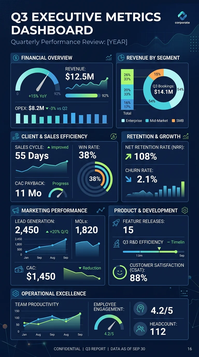
Quarterly Business Metrics Dashboard
Executive summary template showing revenue, growth rate, customer acquisition cost, churn, and net promoter score with quarter-over-quarter trends
About this example
Executive summary template showing revenue, growth rate, customer acquisition cost, churn, and net promoter score with quarter-over-quarter trends
Prompt Preview
Create a business infographic showing a quarterly metrics dashboard. Include 6 key business KPIs arranged in a clean executive summary layout: Revenue with quarter-over-quarter growth percentage, Customer Acquisition Cost (CAC), Monthly Recurring Revenue (MRR), Churn Rate, Net Promoter Score (NPS), and Customer Lifetime Value (LTV). Show each metric with a large number, a trend arrow, a mini sparkline chart, and a brief benchmark note. Add a summary insights section at the bottom highlighting key takeaways. Use a professional corporate design with deep navy, white, and accent gold for positive metrics and muted red for areas needing attention.
More Business Examples
View all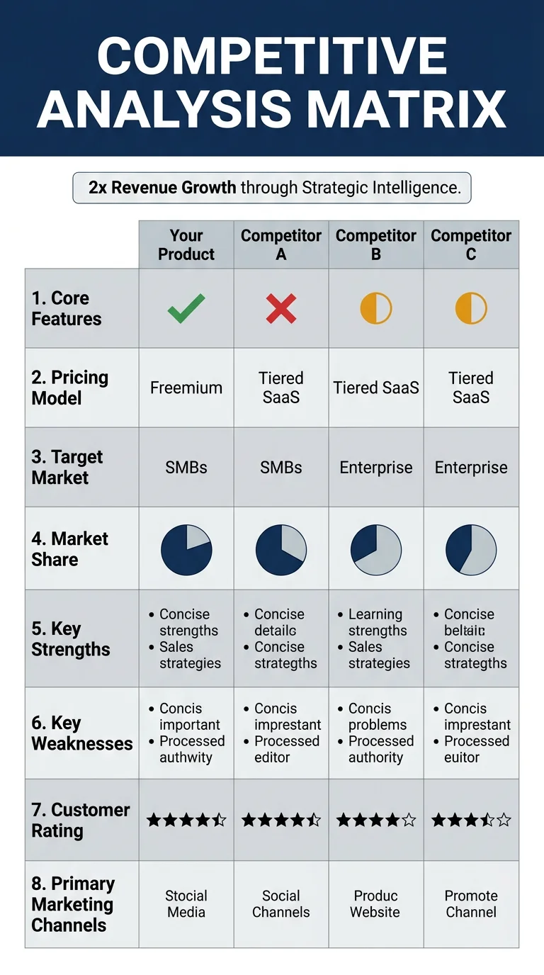
Competitive Analysis Matrix
Template for comparing your product against 3 competitors across features, pricing, market position, strengths, and weaknesses
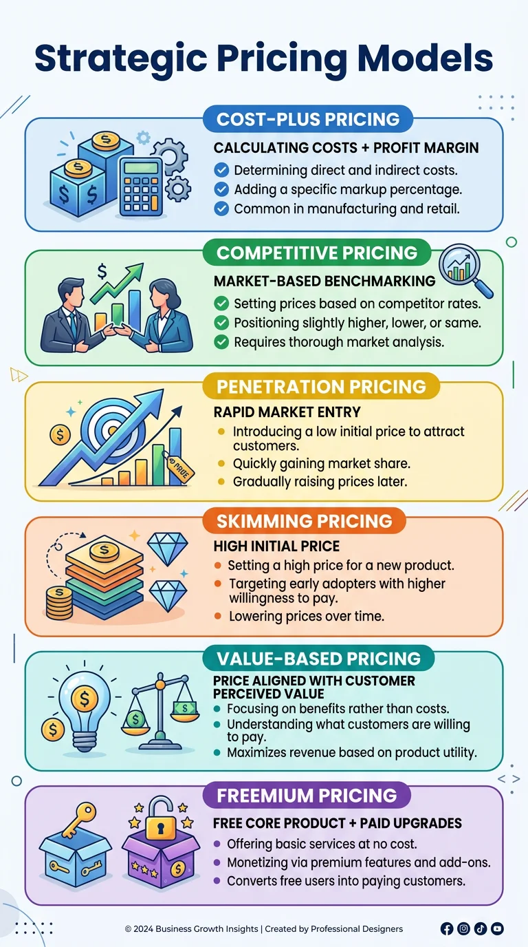
Pricing Strategy Models
Comparison of 6 common pricing strategies including cost-plus, value-based, competitive, freemium, penetration, and skimming with when to use each
Want to customize further?
Use this example as a base, then tweak the prompt, upload your own data, or add reference images for a fully custom result.
Generate from This Example